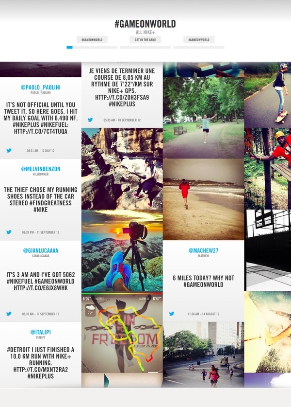
The Nike+ FuelStream is a curated social media experience hosted, currently, on Nike's "Game On, World" site. I apologize for the marketing-speak of that last sentence, but it's a fair description of the site, even if it makes me feel dirty.
The site, actually an iframe meant to be embedded across multiple Nike sites, is a never-ending stream of Instagram photos, tweets and Nike promotional material.

While I'm exceptionally proud of the site, even though I forgot to blog about it for 3 months, what I'd really like to talk about is the process we used during development and the software & testing stack.
As you many already know, I really love Ember.js. The FuelStream project has many different "views" which are reused often and constantly refilled with new data. Ember makes it a breeze to setup the core views and let controllers manage how many we need and what their contents are.
The controller abstraction let's use separate the views from the specifics of their data. In our case, we wrote custom collection pools to handle the specifics of how content flows from the backend into the stream.
While I'm throwing around free code, here's an implementation of "Single Table Inheritance" for Ember.js. This basically means you have a column in your data, say "type", which tells Ember which Model to use for the given record. And here's its View-related cousin, a collection which renders different views depending on which "type" each row is.
I've yet to find a good way to talk about State Machines (or State Charts), but I'll keep rambling about them anyways.
Ember.js has one of the best State Machine implementations on the client side. I should know, I wrote the JavascriptMVC/CanJS implementation. I also love the pure JS version of the Ember.js state machine, known as Stativus.
The FuelStream uses two separate State Charts. The first is a global state chart which controls the flow of the entire application. It handles loading, animating, interaction and the detail modals.
The second state chart is per-view and used only for complex animation. I'm a state chart junkie, so I use them to manage state, even in the middle of complex, multi-tween animations. The FuelStream has an animation that takes a 2-square tall view (top square is an image, the bottom square text referring to the image), collapses it onto itself, flips around to reveal a new image, then expands back out to reveal the new image's text content. Each view uses an instance of the same state chart, so we can track where each view thinks it is in its lifecycle. That's super handy for debugging. Here's an outline of the state chart:
The thing that makes this project so special, in my mind, is our test-driven development of the frontend. I've got a strong Ruby background, and abhor anything related to Node.js, so we used Cucumber and RSpec to write our tests. PhantomJS is a headless version of Webkit which can be used to simulate a browser environment in which to run the tests.
Each View get it's own "preview" file. This is an HTML page which contains several instances of the View and different data sources to test. Then we write our tests, for example, if we wanted to test the top navigation which shows which "time segment" we are currently showing:
Feature: Time Segment
    Scenario: Regular View
        Given the "time_segment" preview is loaded
        When targeting the time segment view at position 1
        Then it has the class: .segment
        And it does not have the class: .is-active
        And it does not have the class: .is-hover
        And the segment width is 200
        And the segment flag says "testing1"
On commit to GitHub, our staging/testing server (Jenkins) runs all the tests and lets us know if anything has gone wrong. With this approach, we were about to have several front-end developers working in tandem without breaking each others' code. Well… they still broke each others' code, but the immediate email from Jenkins made sure they felt guilty enough to quickly fix the problem.
This project accomplished two things which I don't think many front-end developers attempt: test-driven development & heavily animated experiences. On both counts, I'm really proud of what we've accomplished. Kudos to Jared Moran & Zach Doe, the other two members of the front-end team.